← All worknow showing ( 05 ) / 24

When consistency breaks at scale
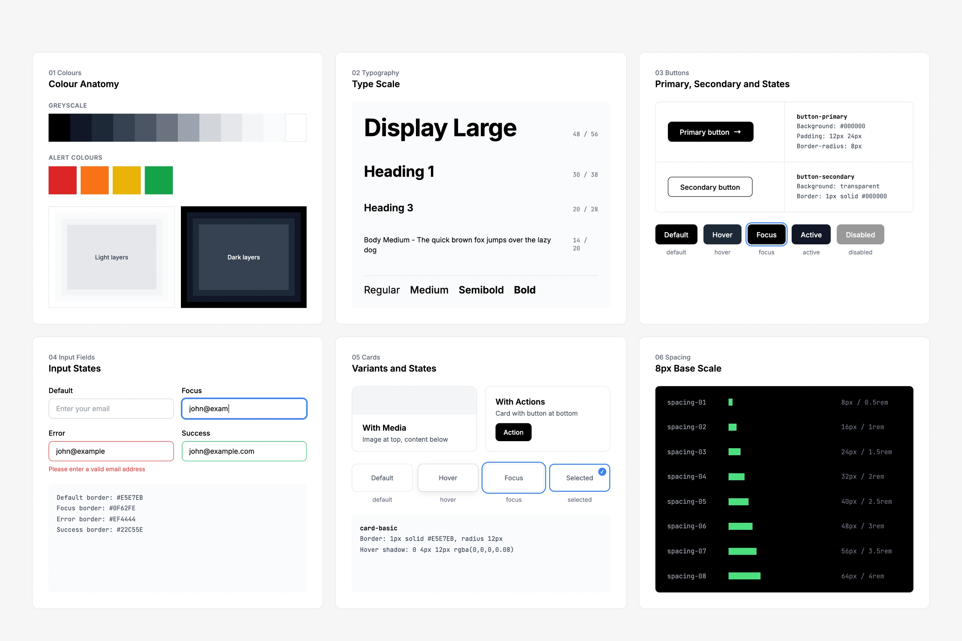
When consistency breaks at scale key visual

i audited 5 products, scored 100+ components on how much they were used, and left behind docs that designers and developers could use on their own.

Client StackUpDuration 1 month, 2024Role design system auditTools figma, figjam, storybook, notion, clickup
( 01 ) Challenge

five products had the same problem, and it kept growing.

stackup's apps grew faster than its design decisions. button states drifted, spacing wandered, and people rebuilt components because nobody knew which version was the real one. we had flowbite, but no system holding it together.

( 02 ) Goal

i audited and documented while deciding what to fix first.

audit every component for gaps and drift( 01 )
decide how components and specs get shown, so the docs can scale( 02 )
build a framework for what to fix first( 03 )
↗︎↑ without priorities, teams fix whatever is loudest.
( 03 ) Structure

i pitched a modular structure before writing any docs.

every section stands on its own, so people find what they need without reading the rest.
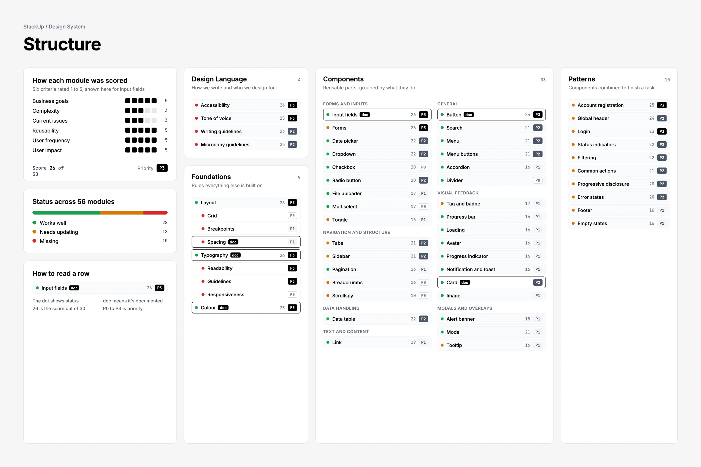
5products
8experiences explored
7foundations
100+components & patterns
modular documentation structure
( 04 ) Scope

a foundation the team could grow into.

after i left they'd need a clear structure, a reusable template, and a ranked list of where to start.

interviewed designers and developers about pain points( 01 )
inventoried every component in notion( 02 )
scored them on usage, complexity and business value( 03 )
set up the figma workspace, with figjam for sprint planning( 04 )
ran delivery in clickup alongside my pm( 05 )
cross-checked the docs against storybook( 06 )
( 05 ) Template

one template, so whoever came next didn't start from zero.
usage context( 01 )
design rules: padding, states, variants( 02 )
related components( 03 )
dev notes on logic and accessibility( 04 )
do's and don'ts( 05 )
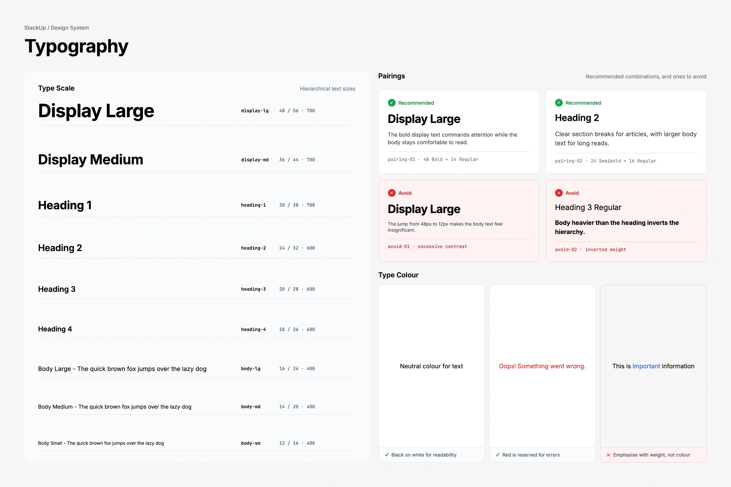
type sets, reused as the template for other foundations
( 06 ) Foundations

where i had the most opinions.

type: a fluid scale built around context( 01 )
colour: named for what it means( 02 )
spacing and grid: base units that hold across every product( 03 )
( 07 ) Components

then the components, starting with the most used.
forms, which run through every admin tool and backend workflow( 01 )
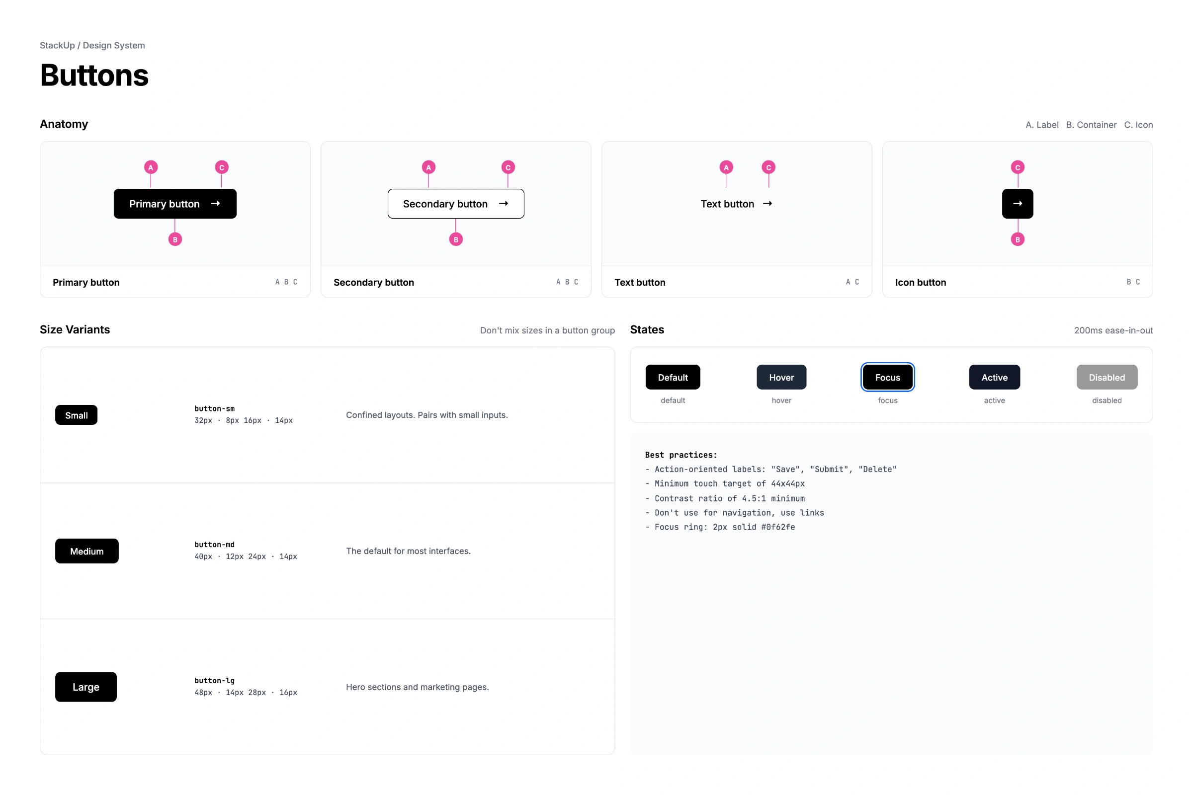
buttons: several versions, none agreeing on spacing or hover( 02 )
type elements shared across layouts and nav( 03 )
usage and style rules for buttons
from: Christopher

Through her meticulous approach, she uncovered a range of inconsistencies that had crept into our applications over time. Shantini's design system wasn't merely a style guide; it became a foundational tool that brought clarity and cohesiveness across a suite of apps.

Christopher, Head of Product, Tribe
Next track →
Nobody was finding the right events