Nobody was finding the right events
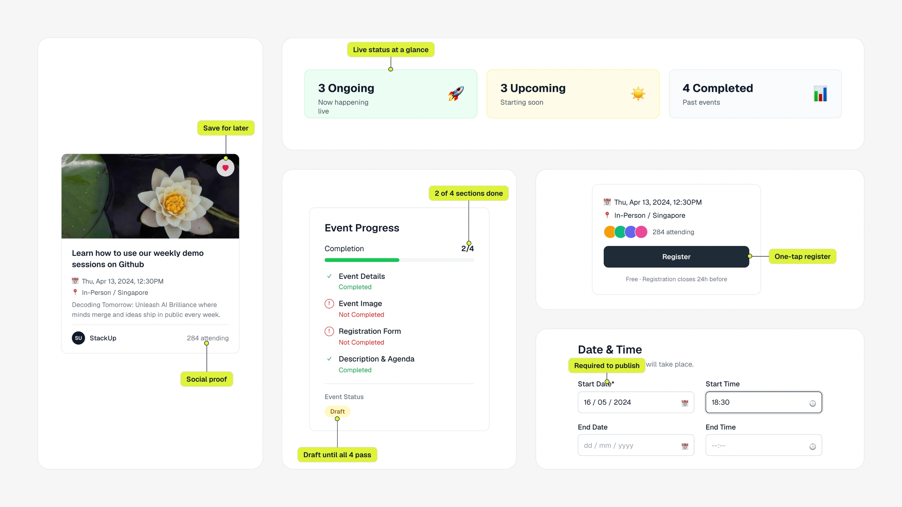
stackup's events ran on notion docs, typeform and google sheets. i designed one platform that's easy to attend and gives organisers real control.
events were happening, just haphazardly.
organisers cobbled it together from docs and spreadsheets. attendees couldn't find the events meant for them, and organisers rebuilt every event from scratch. the ask was one platform. the hard part was making it simple for attendees and flexible for organisers without it feeling like two products.
the feedback was operational.
i always start with the minimum that still feels whole.
for attendees that meant getting from finding an event to registering with no dead ends. organisers needed more. some events are open, others need approval or a custom form. so i designed modular pieces that assemble differently per event type, and kept creating and moderating close together so organisers don't lose their place.
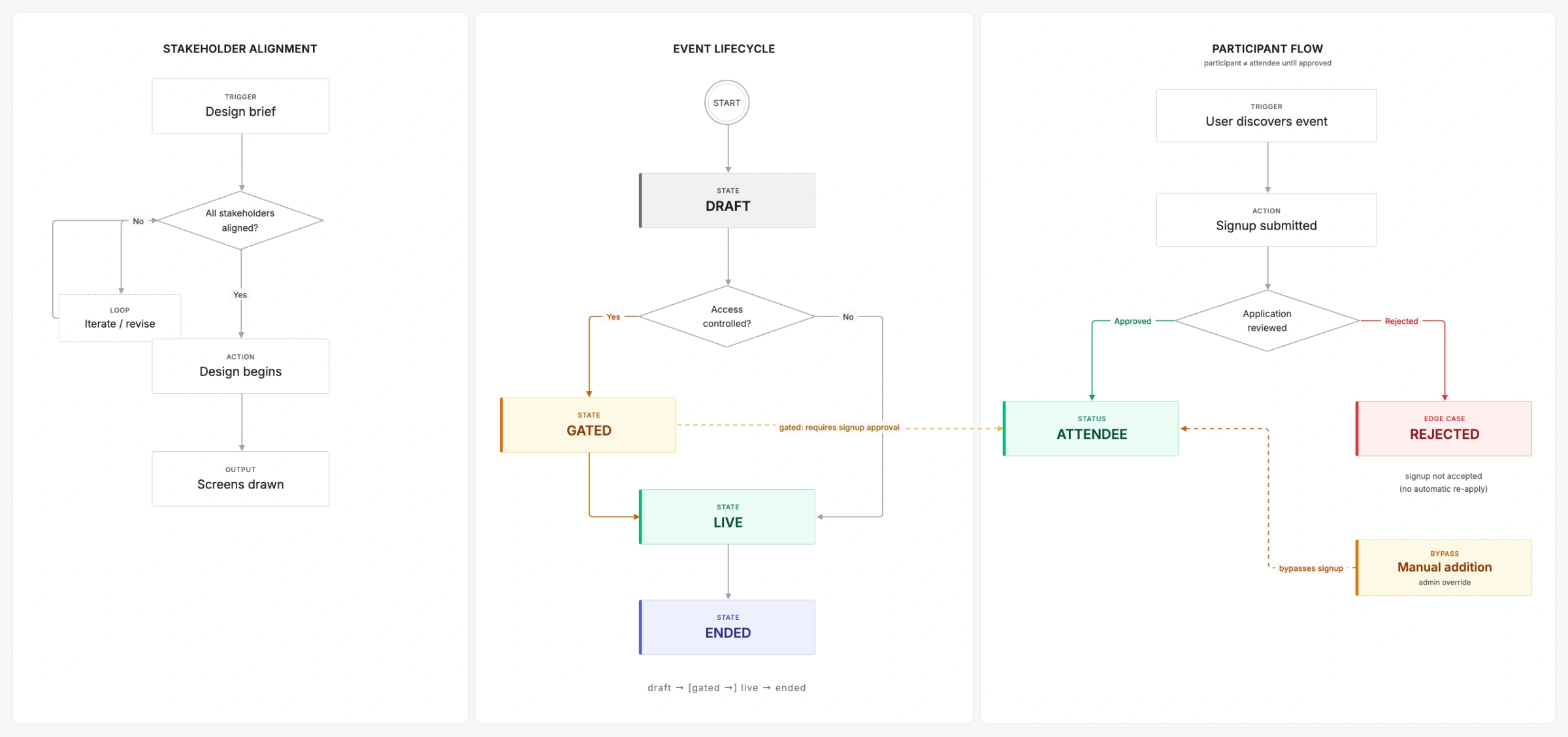
definitions came before layouts.
what counts as an event on stackup? what states can it be in: draft, live, ended, gated? is a participant the same as an attendee? the whole team had to agree on that before anyone drew a screen. kickstarter's campaign states helped. then i mapped everything in figjam, including edge cases like rejected signups and manual additions.
fewer modals.
with the pm, i split the work into three layers that could each move on their own.
it browses like a feed.
attendees find events that match their interests and sign up, whether it's a 10-person workshop or a 500-person conference. organisers set events up quickly and decide how registration works. they can see every participant and export the list when they need it.