The moment before the mistake
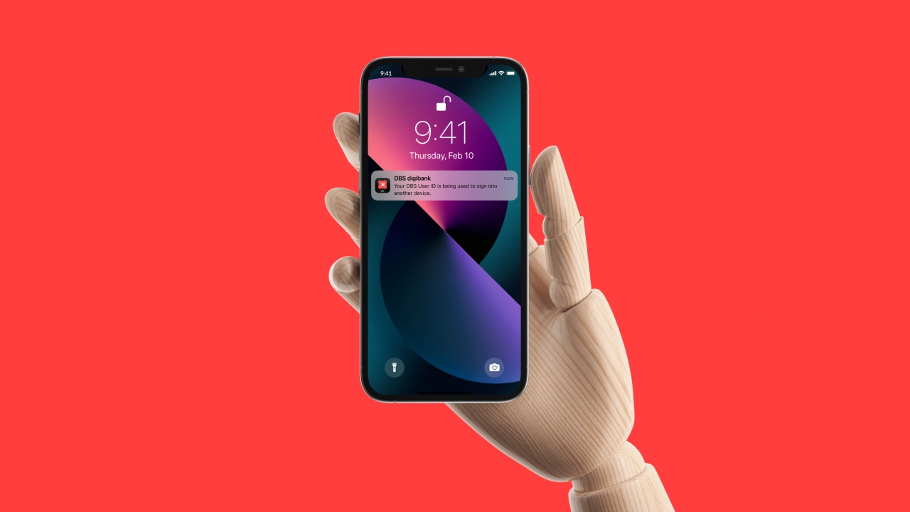
a way for dbs customers to report fraud and lock their accounts themselves, as it happens. soon after we finished, dbs announced a kill switch much like ours.
scams were rising, and reporting one was slow.
singapore recorded 23,931 scam cases in 2021, 5,020 of them phishing. banks were racing to go digital and fraud kept pace. we asked two things: how does a bank know a customer is real, and how does a customer report something while it's still happening?
we started with how fraudsters work.
we read forums and reddit threads from people who'd been scammed. younger people are warier, but scams play on instinct, so age protects less than you'd expect. i did competitor analysis later than usual this time. banks mostly leave disputes to agents, while neobanks like revolut are raising expectations.
in most cases, instant help wasn't instant.
we cut one.
we started with a digital native and a digital novice, but couldn't learn enough about the native's banking to find real pain points, so we dropped it. the journey map followed david before, during and after a dispute. the chance to win him back starts the moment he realises something is wrong.
we sketched together, remotely.
the research was the constraint. we took turns sharing screens and critiquing each other. it left us with practical questions: where do new features go so people notice them, and which icon actually reads as chat?
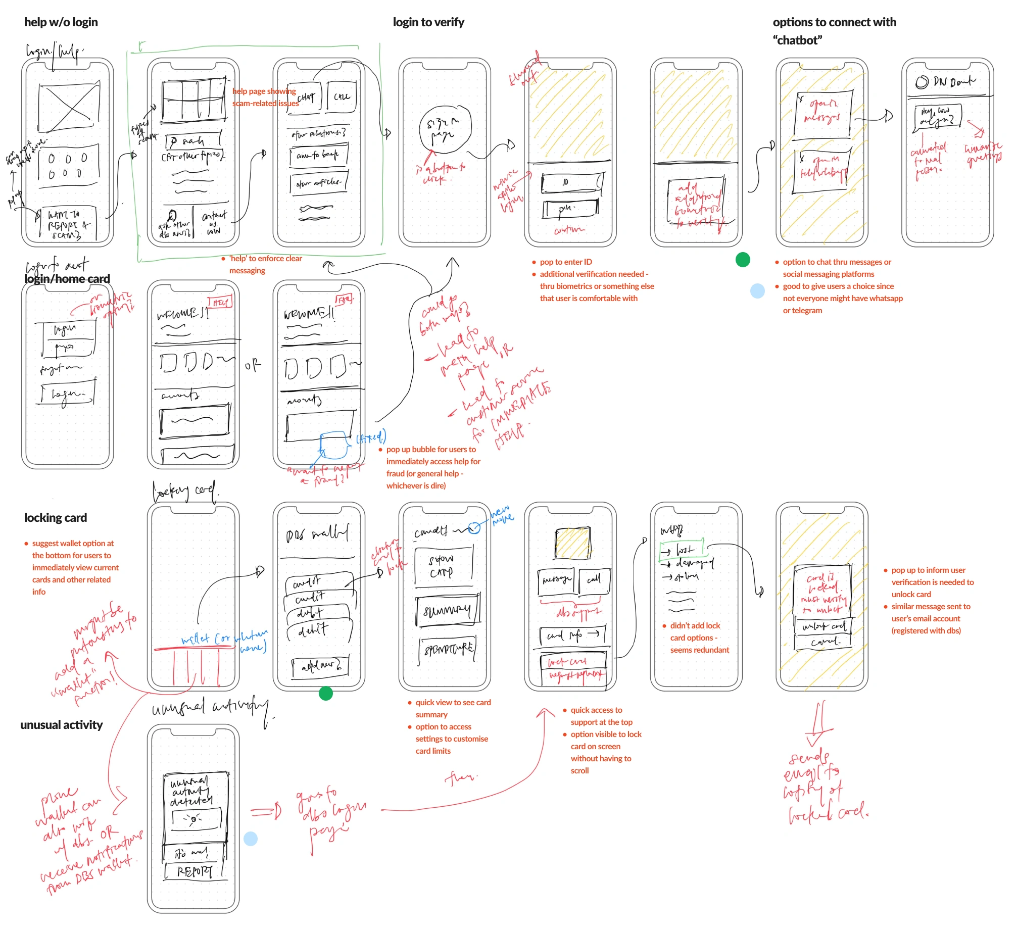
we added four features to the app dbs already had.
we critiqued twice a week, on real phones.
most feedback was about content. keep banking copy simple, and write buttons the way staff would talk to you at a branch. also, the 'bot' in digibot was a dealbreaker.
dbs shipped a kill switch.
dbs later announced anti-scam measures due by 31 october 2022, including a kill switch that freezes all banking activity. we'd designed ours as more than a button, down to how it feels to use when you're panicking. we first wanted to redesign large parts of the app. narrowing to fraud gave us a sturdier foundation.
if i did it again
i spent a while on chatbot design: intro messages, mostly, and how a bot should handle someone who's upset. there was far more to it than we had time for, and testers had already told us the 'bot' in digibot put them off.