social grid visualisations
chanpuru is a digital magazine that wanted its instagram grid to stand out more.
each tile only gets one job.
their stories carry a lot of information, but a grid tile has to pull people in with the image first. so the artwork goes up front, with a dark fade at the bottom to keep the headline readable. the images go from tolkien's ink drawings to anime merch, and a busy one would swallow the text otherwise.
the layout stays put while the stories change.
only the artwork changes. that's what makes six very different stories look like one publication.
we chose it together.
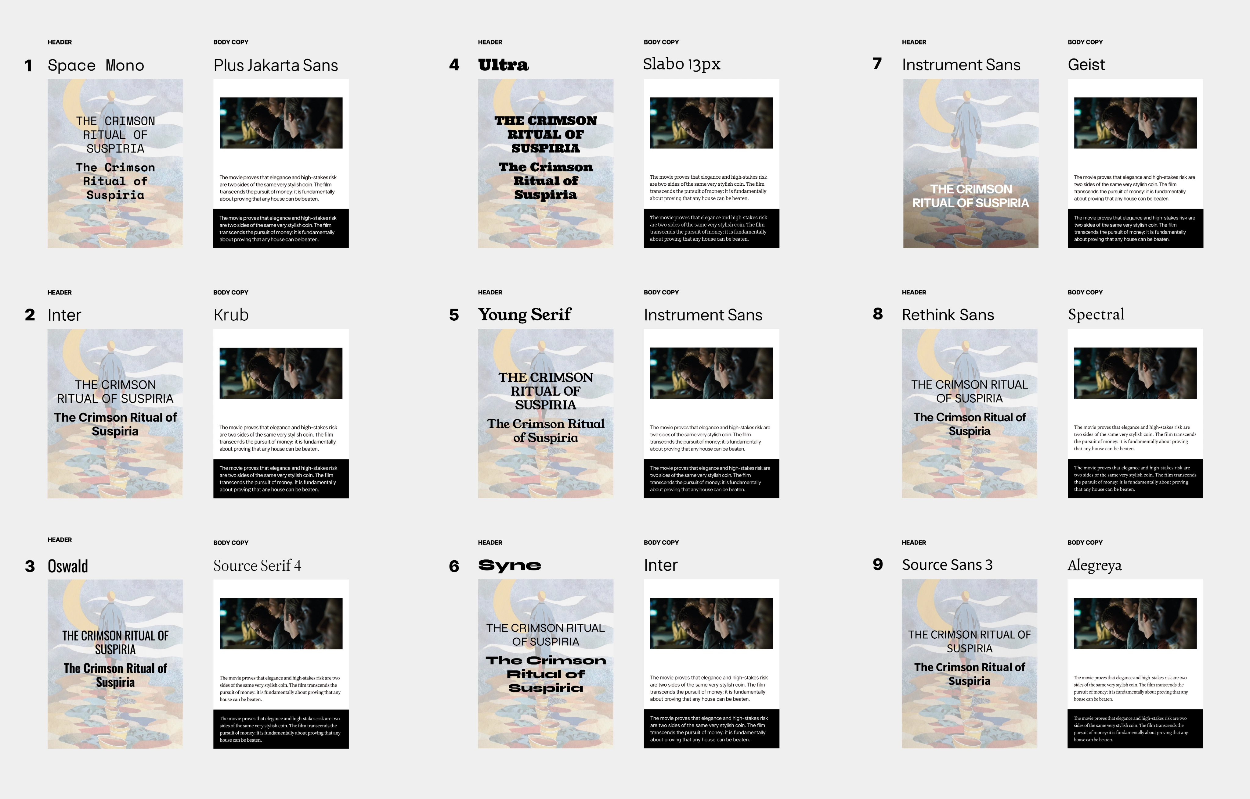
i tried a range of header and body pairings on the same layout and let their team vote. plenty looked good, but the right one had to fit their brand and what they liked. my taste was one vote.
the simplest version, for now.
chanpuru doesn't have a social team to design every tile, so they went with a pared-back version. they kept the fonts and layout i made, so the type and structure carry the look even when the tiles get simpler.