Making progress feel like something
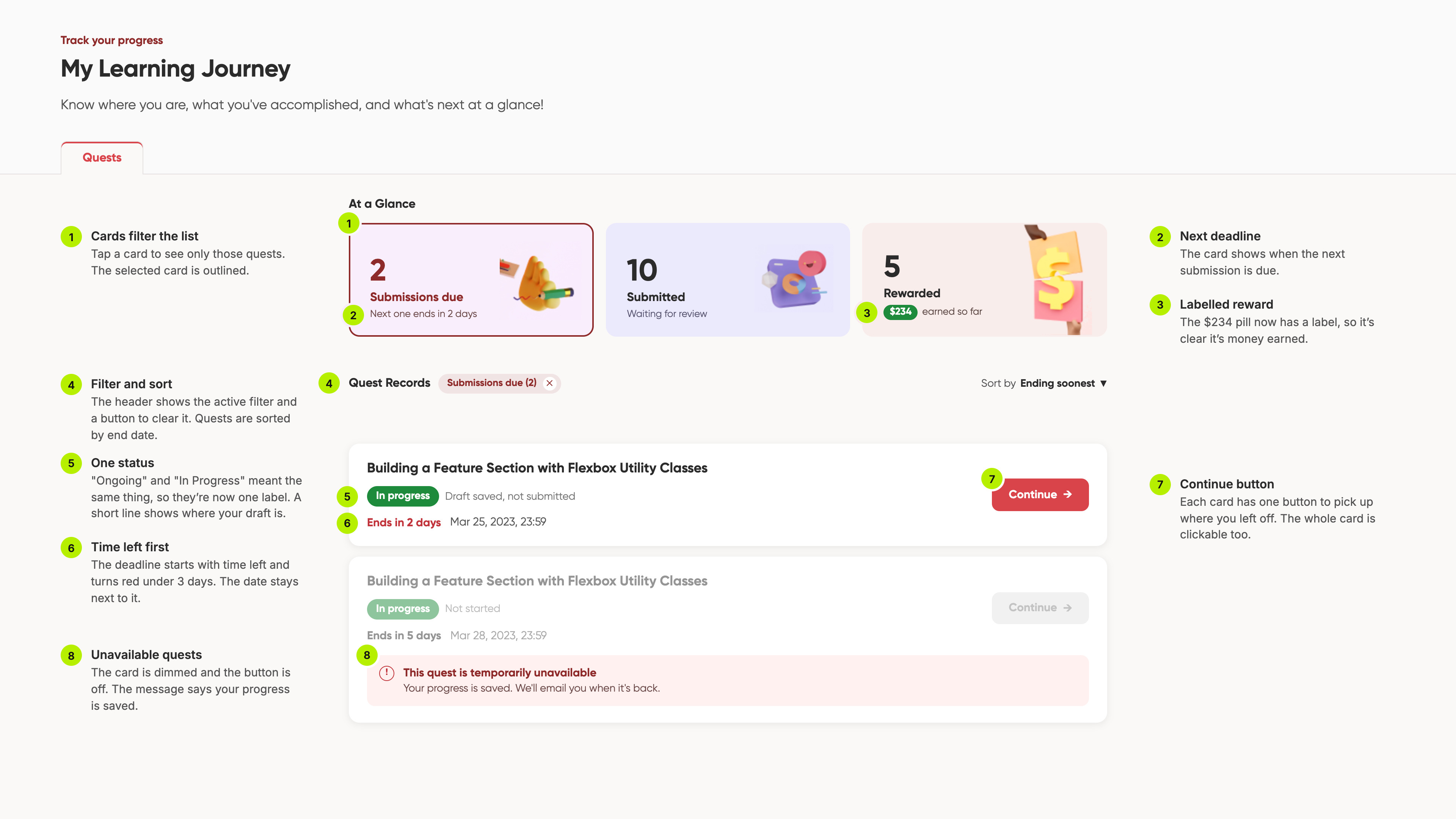
a progress tracker for learn & earn that shows what's done, what's unlocked and what's next, including the awkward cases like archived or locked content.
what are we actually tracking?
completion, time spent, state changes? some content is time-boxed, some archived, some locked behind things you haven't done yet. get this wrong and the whole learn and earn loop breaks.
i wrote down every assumption and open question.
making the mess visible before shaping it is one of my more useful habits. the old bubble prototype showed what was missing: no status indicators, no visibility rules, no way to move between states. learners had no idea what was unlocked or what they'd finished.
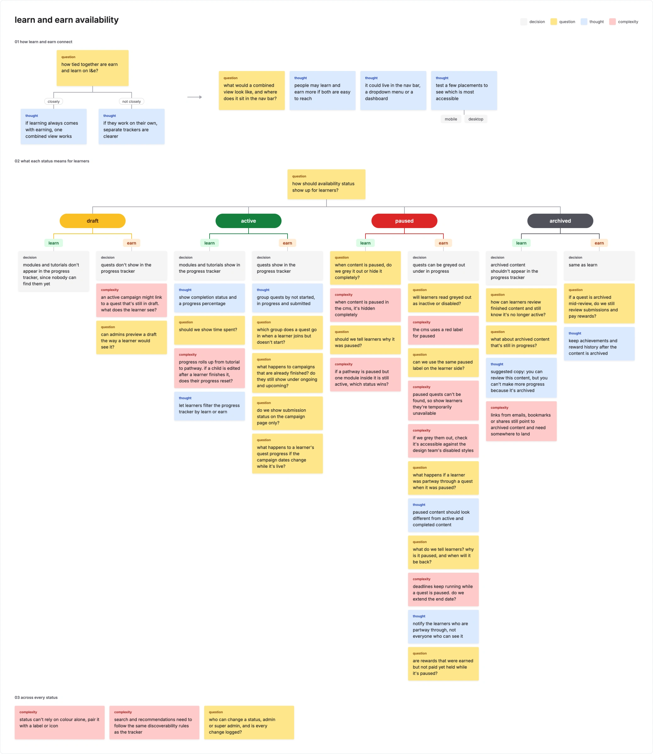
progress doesn't get its own screen.
it lives on cards, in modules, on dashboards and profiles, so it has to be consistent without getting in the way. i split it into micro tracking inside campaigns and pathways, and macro summaries on dashboards and profiles.
how much does someone need to know here?
i asked that at every surface. quest cards show status only. the campaign view shows pathway completion. dashboards give the summary, and profiles show history.
the fun stuff went first.
streaks, badges, xp, all good ideas and all out of scope. what shipped was status on quest cards and a progress overview, plus solid handling of paused content.
"light but dependable."
that's how learners described it. they knew what was next, where they'd left off and how far they'd come. having a shared idea of what progress means also opened up conversations about layered pathways and skill-based tracking.
some cuts still bother me.
we cut things i considered fundamental, including accessibility work i really wanted to prioritise. the directive was to build the most basic version and iterate. i understand the strategy. i still think about it.