From lurking to participating
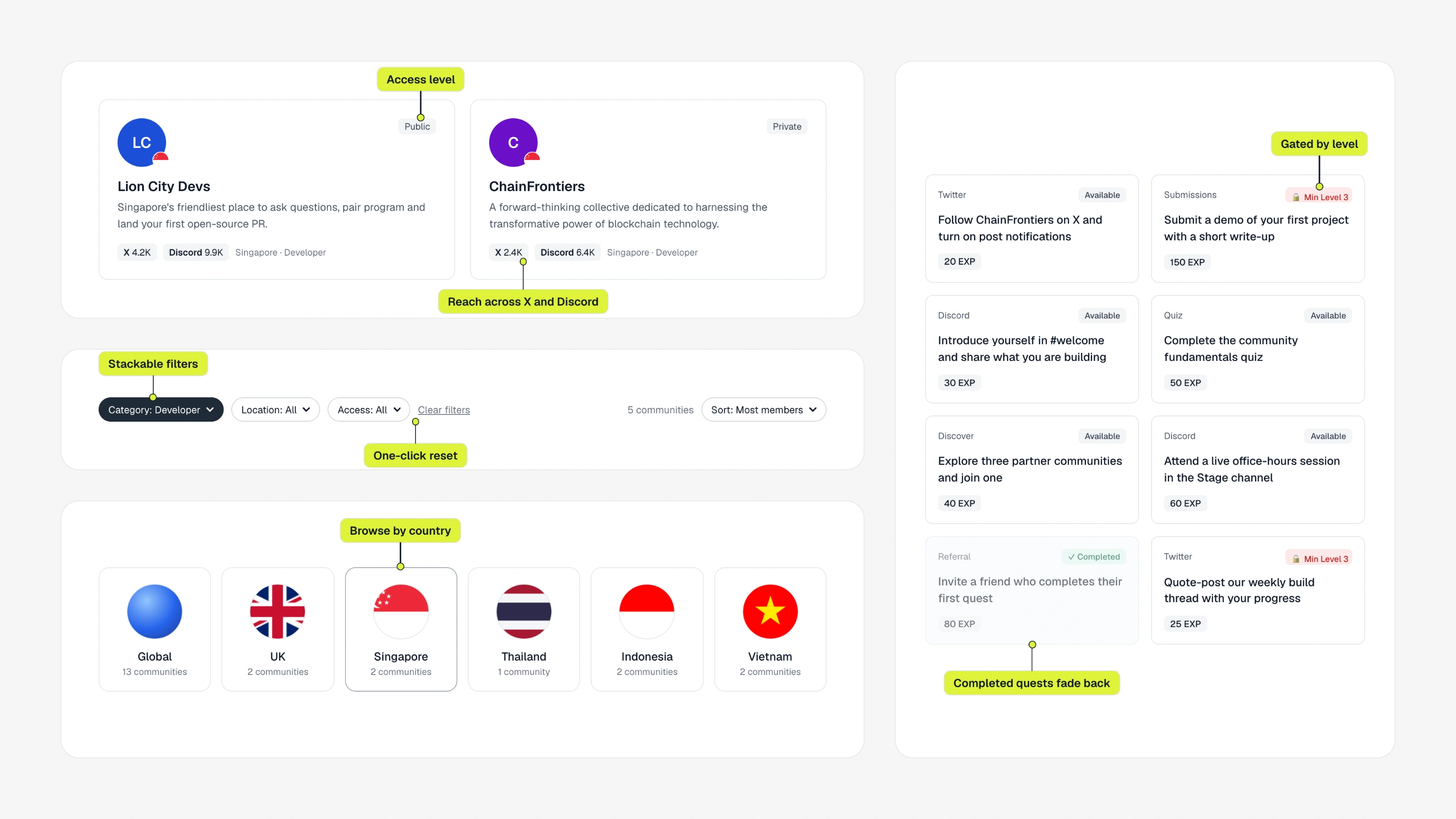
onboard worked, but people kept working around it. i led the redesign, from auditing every flow to rebuilding the structure, and folded its patterns into stackup's design system.
a platform that functioned, and not much more.
onboard is stackup's platform for community engagement and quest creation. the first release worked, but the flows didn't connect and people couldn't find features. users joined the wrong quests and messaged admins to do things the platform should have handled.
i audited everything, then checked it against what people did.
i went through every screen and flow and tagged inconsistencies and friction. then i cross-referenced behaviour data: where people abandoned tasks or invented workarounds, and what they kept asking support to do for them. one question guided the rest: how do we reduce friction without removing intent?
admins and participants want different things from the same platform.
the old flow treated everyone the same. i designed it to infer who you are from where you came in and what you do, so nobody has to self-identify or get stopped at a gate. onboarding asks for just enough to move forward, then steps aside.
built around what people are trying to do right now.
the old structure mirrored how tribe thought about the product internally. people moved through it differently. i rebuilt it around two questions: what are they trying to do, and what do they need next? scattered management tools became one dashboard. templates moved into the workflows instead of a tab nobody opened. i tightened the visual hierarchy at every decision point.
we couldn't ship everything at once.
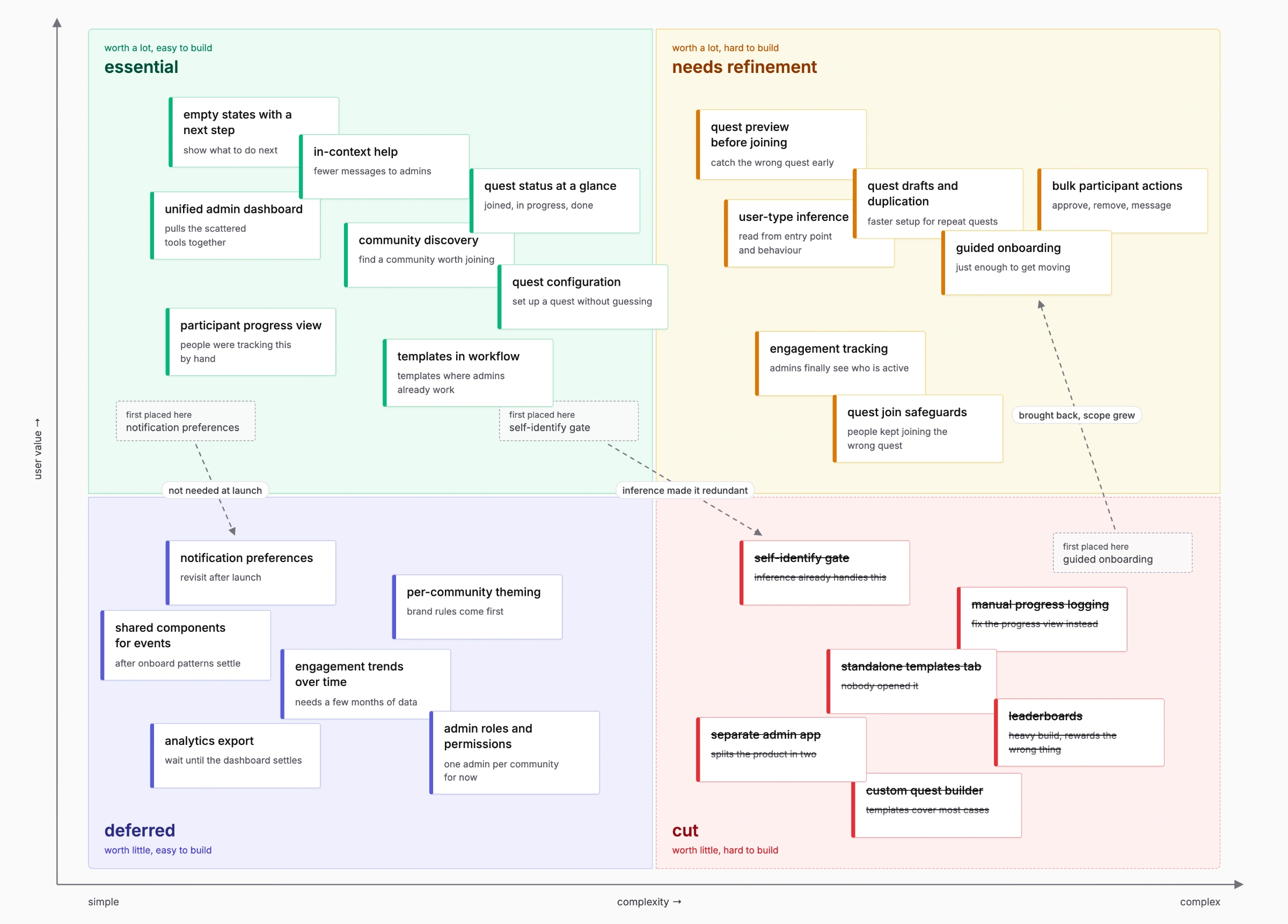
i sorted every feature into essential, needs refinement, or deferred. some were cut entirely because the complexity outweighed the value. fewer things done well beat everything half-finished.
internal teams said it finally felt like stackup.
navigation made sense. admins could see engagement they'd never had visibility into. bottlenecks that had been there since launch were gone, and the foundation could scale, which the original was never built to do.
the patterns went further than onboard.
i replaced inconsistent ui elements with standard patterns aligned to stackup's updated brand guidelines, some adapted from other products and some built from scratch to fill gaps. onboard's components now power events and other tools without anyone redesigning from scratch. that felt like the bigger win.