Buying and selling shouldn't need instructions
papermarket's site had plenty of visitors and few orders. i redesigned it so people could find products and understand them without a shop assistant.
people visited and didn't buy.
papermarket sells paper and craft supplies in singapore. the pandemic pushed them online, and their own site got traffic but few completed purchases. i'm not a crafter, and even i found it hard to navigate, so their analytics came as no surprise.
ten interviews and a lot of card sorting.
people missed the shop.
in store you can ask how something works, and shoppers often don't know. everyone i interviewed said they'd shop online if they could find what they wanted, come across new things and still feel excited about the order. trust came from information, mostly reviews and detailed product pages.
the hardest part.
in open card sorts people split products into more than seven categories, too many for a nav bar. the closed sorts showed which categories held up. i merged the overlapping ones and flattened the hierarchy so products sat fewer clicks away.
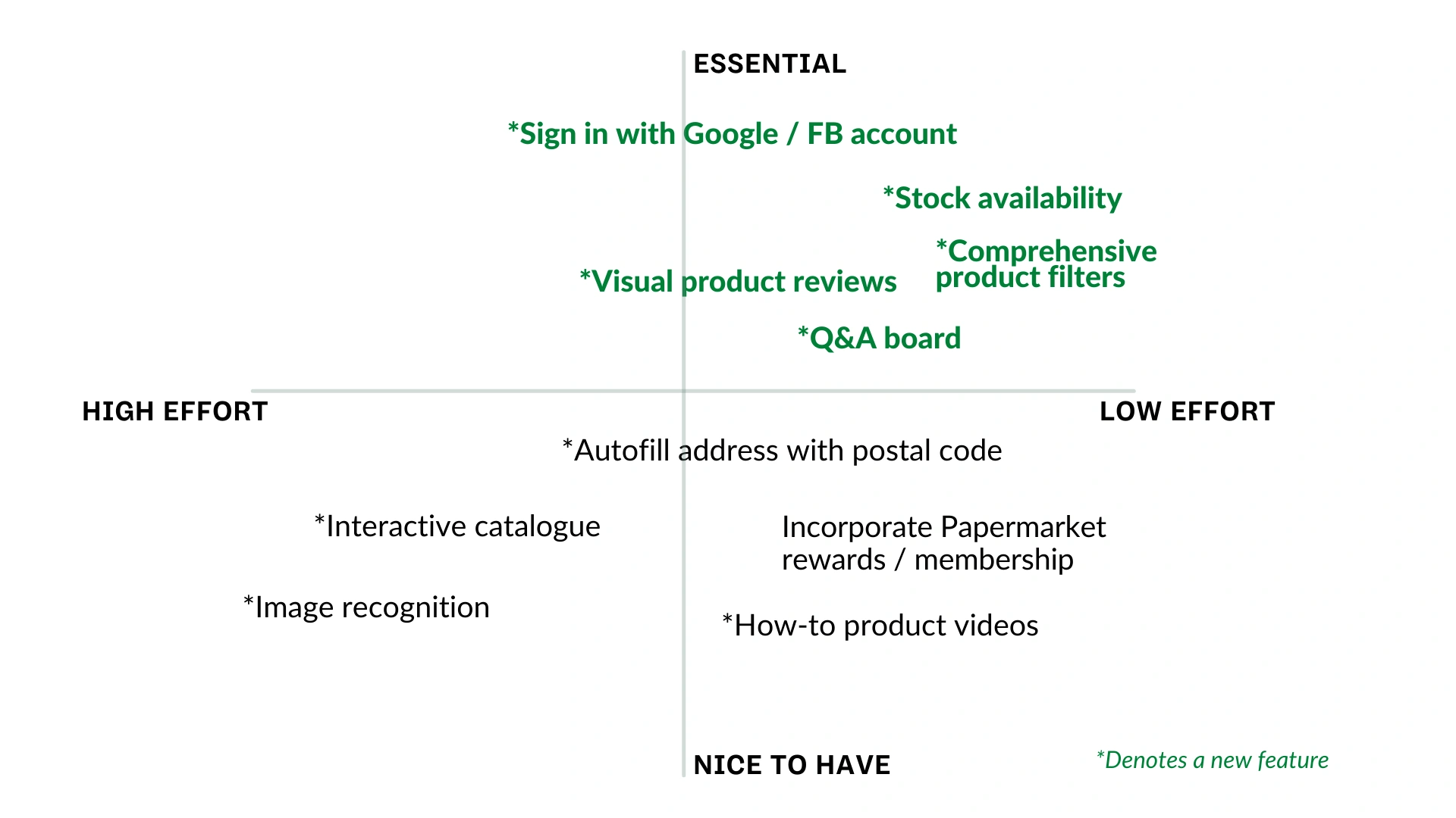
three things on the product side.
testers got through the main tasks.
the fixes were small: nav tabs too close together, prices missing on recommended items, store reviews hidden under 'about', a glitchy colour filter, and a contact overlay that scrolled without a scroll bar.
if i did it again
one of my earlier projects, and where i learned to pivot. every feedback session fed the next iteration, and the long list of ideas narrowed to the few focused enough to build.